
compare & connect
Project Brief
How might we increase our sales and SEO ranking
Key Stakeholders
Founder & CEO, CIO, Marketing Director, Chief growth officer, Client campaign manager, Accounts managers legals and regs from 17 energy retailers.
Project Goal.
Redesign the entire funnel and remove all the redundant clicks & interactions. Drive more traffic to the website. Clean up the look and feel.
Timeline.
I had one week to redesign the comparator sales funnel. Marketing campaigns were set to go out to all the major media outlets and socials. The CEO wanted the website to showcase compare & connects ability to provide Aussies with an easy, quick way to compare. compare & connect had the best comparator sales funnel... but, there was a lot that needed improving.
Research & Process.
When I started at compare & connect their was a DLS already, but, it was dated. I conducted a lot of comparison research and cherry picked interactions and alterative flows I found from products and services in the online shopping space, Airbnb, Compare the Market, Alinta, Momentum, Aussie Broadband, Telstra & many more. I conducted usability testing six months prior to the redesign kick-off. I had no budget for usability testing so I called on my large network of friends and family to help. I interviewed thirteen people from all walks of life. Housemates, new home owners, renters, Millennials, Gen X and a few Boomers.
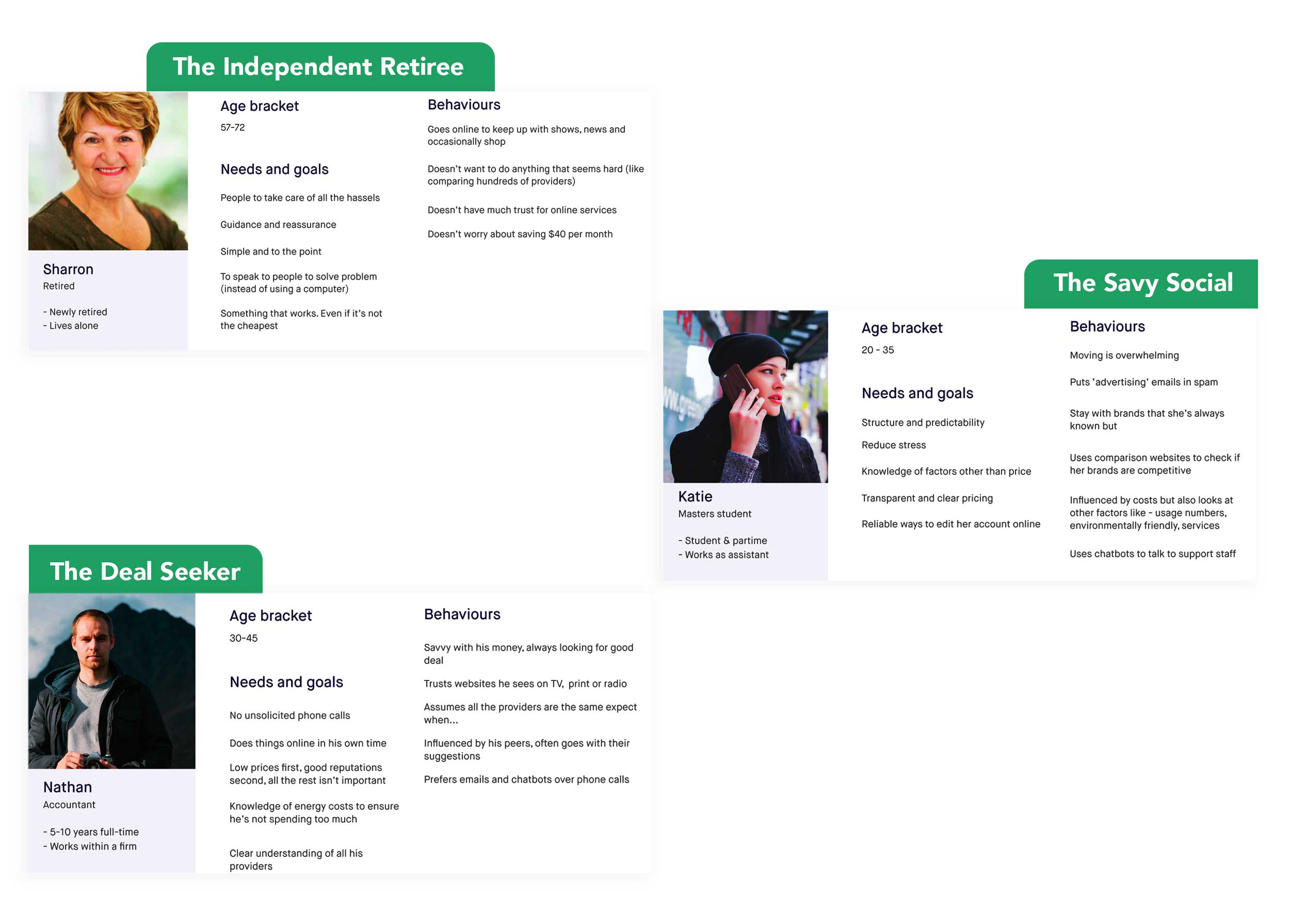
Personas.
Based on insights gathered from my gorilla research phase, these 3 Personas were developed. The 3 personas represent customers who are savy, go with trusted brands, influenced by friends and family, don't like to call, and dont like being called.
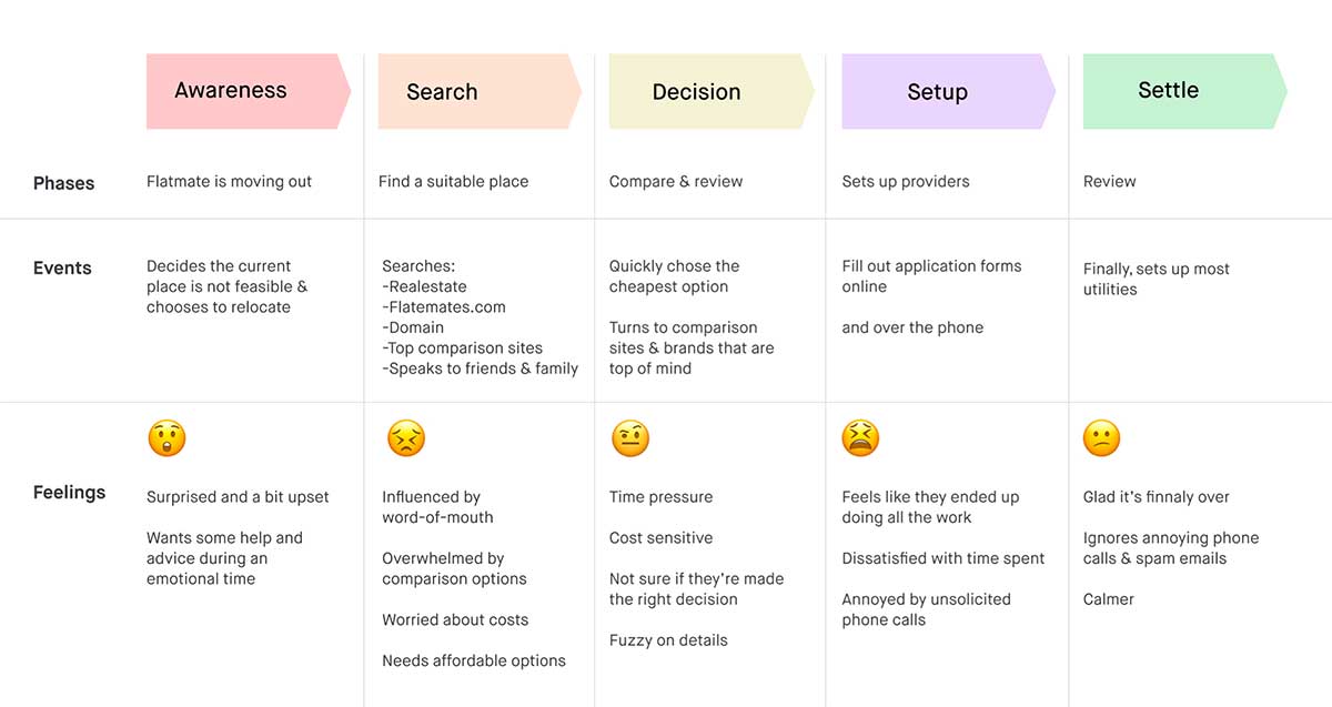
Their Journey.
The top 3 wants and needs. Appropriate pricing (competitive), No spam or unsolicited contact. Smooth connection with no problems.
Competitor Analysis.
What's in the market right now. Insights: people trust brands they're familiar with AND brands that have a clear offering. Recommendations: position brand as hassle free unlike Competitors, promote not selling info to spamy companies, super simple, transparent & accessible comparison that... Truly helps you with connetion (unlike Competitors).

Lo-fi wireframing.
I built a lo-fi prototype initially to showcase a bug I found in the connection date feature. From the prototype the back-end development team built a Date API. The Date API flagged next day removals and recommended to the user to pick a date greater than a day so they could see more products & plans available to their NMI. The Date API also disabled public holidays and weekends (Tier one energy retailers can do next day and weekends), however, Tier one retailers are'nt always the cheapest. When the user selects next day they will only see Tier ones. and or the providor of last resort. The Date API offered users the ability to see every plan available to them.
Development & Launch.
After designing, designing & designing some more I began collaborating with the Front-end and Back-end teams.
Before
After
